#doing the actual cleanup and linework
Explore tagged Tumblr posts
Text

this is STILL not my beautiful wife
#gravity falls#bill cipher#stanford pines#animation#im just posting all my wips here over and over. enjoy.#i procrastinated so hard on drawing his tie or trench coat#that i instead animated the entire second ford for the background. and then put a tie and trench coat on that one.#turns out fabric animation isnt quite as scary as i imagined so im a lot more confident about animating it for bord prime#then its just a matter of tweening the background ford#tweaking the timing#doing the actual cleanup and linework#and coloring#and im done!#animation is so time consuming. i cant believe no one has ever realized this before#im getting quicker though!#the fact that im rotoscoping this both helps and hinders my speed#im also still drawing all of this on my touchscreen laptop with my fingertip bc i have yet to plug my tablet in#my wrist brace is getting more use this week than it has in years#fluffle art
106 notes
·
View notes
Text
Here’s a breakdown of my animation.
Once I created the cave set in 3D, I retextured all of the blocks to be a wireframe so I could more easily keep the proportions correct as the camera moved through the scene. I began with a simple box person body. Not only did this help me make sure the proportions were correct but the different angles and sides of the character helped me eventually keep the characters features in the right places later. It’s very rough, but it was a good indication that I was on the right track.
Then began the tedious process of refining the animation. I did a new pass over the original animation with all the features of the character. It’s more detailed, but it’s just as rough in a lot of ways. I wasn’t trying to ensure elements were consistent frame to frame, so you can see a lot of the linework is very wobbly and inconsistent.
Once that was done I went back and did a cleanup phase. This helped smooth out all those inconsistencies and I worked on making sure the animation was smooth and flowed nicely. This became the basis for the final inks and color.
When I’d gotten far enough into working on the scene I went back to the 3D model and rendered it out in multiple passes. I did a flat lighting pass which you see here, and then a shadow pass. I combined the two in Premiere, added some color adjustments and then rendered it out to be used as the background for the final product.
I imported the finished rendered background into Procreate Dreams and began the final coloring. I’d already previously decided on the desaturated colors that would make them fit in this cave environment, so coloring was actually a breeze.
The final two elements that really brought it all together was a shadow layer and a glow layer for the torch. The shadow layer was tricky, but it definitely helps make it seem like the character is interacting with the environment.
As previously mentioned I thought I was going to import this into Procreate and animate it there since I like the Animation Assist tool in Procreate more than I do with how Dreams works. But ultimately because so much of this animation was tied to the movement of the camera I ended up animating ALL of this in Procreate Dream.
I’m really proud of my work here. If there’s anything you wanna learn more about how I worked or anything please feel free to ask, I’d be more than happy to talk about the process more!
#procreate dreams#procreate#animation#2d animation#procreate animation#hand drawn animation#dreams#procreatedreams#classic animation#minecraft story mode#mcsm#Minecraft movie#animator#minecraft#a minecraft movie#female jesse#mcsm jesse
1K notes
·
View notes
Note
Hey, I was wondering if you have a brush recommendation for CSP brushes for Lineart with good line weight? I'm trying to improve the weight of my lines, but I'm having a hard time finding brushes with the flexibility I'm looking for
That's a good question. There are all sorts of ways line weight is used and the right brush is different for each genre and style of drawing, I'd say.
To start: A lot of my lineart brushes are adjusted with slightly LESS brush size dynamics because I always felt like the original default CSP brushes (like the Mapping Pen and G-Pen) gave an unrealistic and uncontrollable amount just based on the their pressure settings.
Some people do use them well for specific styles, so they're not inherently bad. But I definitely think they're not friendly to beginners or people who just wanna pick up a pen and go draw rather than obsess over the precise way they're pushing down on their pen.
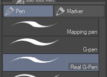
More recent versions of Clip Studio Paint actually came with some new default brushes, including "Real G-Pen", which had pressure settings that felt more right to me. But it's a little noisy so its uses are a bit more specific.
I have a brush set included with EnpitsuP called Superclean Linework. Those are the ones I designed as cleanup brushes for anime-ish looking art. They come in several flavors: Densy, Softie, Smoothy, Sang. I varied them based on how I saw different artists preferred their lines: a bit on the sharp side? Slightly blurry? With a little bit of opacity fade? A little more line variation? Among these, Sang has the largest amount of size response.
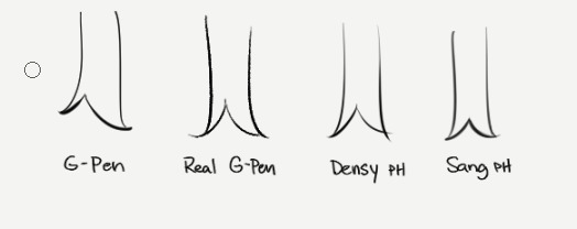
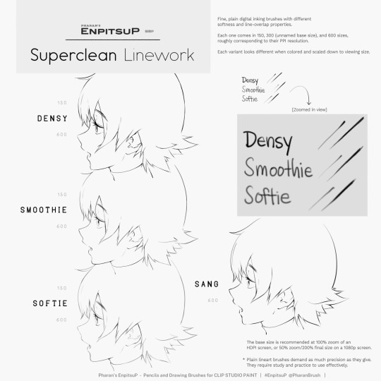
Ultimately, it may be a little bit of both a subjective experience and depend on what your hand/tablet/driver settings/style preferences are like. If you're having trouble finding a brush for this purpose, I think you should hone in on if you're not finding the right brush because every brush seemed too difficult to control, or you can't seem to get results you like, or you can't find one with a feel that matches the physical tool you're used to.
I think it's also worth noting that some artist's styles also rely a lot on them just changing their brush size setting depending on what part they're drawing. So you may end up needing a brush that has less pressure-size variation than you expect. My recommendation is always to look very closely when learning from someone else's linework example. Try to achieve it yourself side-by-side and see where it doesn't quite match up and ask yourself why. Or ask others why.
Of course, there are a bunch of other "lineweighty" brushes too outside of this genre of mostly-thin lineart.

#clip studio#clip studio paint#pharanbrush#clip studio brush#clipstudiopaint#clip studio paint brushes#EnpitsuP#KrupukP#csp brushes
82 notes
·
View notes
Note
Have u ever posted your comic or animation workflow anywhere? Im super curious on how you tackle the process, especially not using a drawing tablet. I know you have a very simple (and adorable) style so that probably helps in terms of workflow -- Im just curious about the steps you take.
Thank you! With both comics and animation my key thing is to not spend too much time on any particular thing, just draw loose and fast. Honestly the only downside to drawing with a mouse is that I can tell my arm has extremely specific muscle memory regarding it- if my mouse breaks and I get a new one I have to spend a good month or so just letting my hand get used to it again lol. Same with if my setup gets readjusted too much- right now my setup is my mouse on one of those padded mousepads, on top of 2 books, with my elbow resting on my 3DS case (I'll get an actual pillow or something for it eventually lol). But luckily thanks to this I suffer very minimal wrist pain 👍
(...Okay I started to go really in depth in my process here, so sorry if this is way more than what you were asking. Putting it under a readmore just to save space lol)
With MFM in particular, I start by writing out the entire script for the next story arc, which really is just all of the dialogue and vague notes about any important actions. Then I do the paneling with very loose stick-figure like sketches of where the characters are and what they're doing. I prefer having very little planning when it comes to character poses and panel shapes, coming up with those on the fly makes things much more exciting and faster to make. But it's the opposite with dialogue... it needs to be 100% FINAL before I draw a single line lol.


That's part of my script for my most recent chapter, as well as what my extremely loose goofy thumbnail sketching is like. I write the script as one big thing and don't separate it into pages until I actually start drawing- then I go and color change it just to keep track of what dialogue goes on each page
After that, I go back and do the ACTUAL sketch, as well as the lettering (I don't believe this is how it's done professionally. I used to do lettering as the very last step in the process... but then found it hard to cram speech bubbles in the right places lmao.) After that is lineart, coloring, background flat colors, then shading/rendering for all of it. I do each step in batches, as in I sketch out ALL pages of a chapter before moving to lineart, I line ALL pages before starting coloring, etc. I find it way easier to be productive when it's broken up like that, though when I first started the comic I used to draw each page to completion before starting the next (but also, the comic's style was DRASTICALLY simpler back then haha)
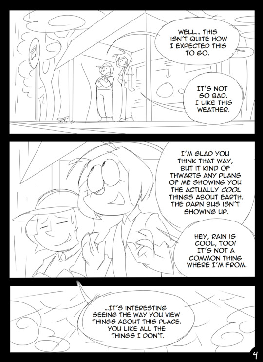
(Unfortunately I merged some of the shading to the background flat colors so it's not entirely accurate... oops) FireAlpaca has a sand texture feature that I only found out about last year- adding that to the backgrounds makes them look 10x better with WAY less effort.
With animation, it depends on the project. For simple 5-10 second animation I make for fun, there's very little planning lol. I skip some steps in the process- I'll sketch out the keyframes (and maybe any difficult inbetweens if necessary), line those, then go straight into making linework inbetweens. I'm not a cleanup artist and have no experience in that, so I always find trying to line my rough animation makes everything jittery and wobbly. If I do it with a clean line from the start then I can avoid that and save a lot of time 👍
For my bigger projects (such as the Parvey cartoon and the MFM Kickstarter trailer), I do the whole animatic with final audio first and foremost, with the animatic being almost like the keyframes. I split them up into individual shots, .mp4 files anywhere between 1-30 seconds usually, and animate those one at a time. I'm a huge fan of free to use programs and try to use them as much as I possibly can, here's a list of the ones I use:
FireAlpaca- for the actual drawing part itself (storyboarding/animating/etc). FireAlpaca has a feature that lets you export every frame as it's own drawing, as well as an onion skin mode
Windows Movie Maker- for compiling all of those frames into video format, creating individual shots. If you upload all of your frames and set them to around 0.08 seconds, it equals about 12fps (I usually animate at 0.10 seconds/10fps, its a bit slower but looks nice)
Onlinesequencer.net- for making music. It's the place I've made all of my songs on, like the timeloop song, hyperworkaholic, and the background music for the MFM Kickstarter trailer.
Audacity- for editing audio/music. Also great for recording things directly from your desktop
DaVinci Resolve- for editing and putting together all of the shots into one big video. Can get kind of intensive on the computer during rendering, so watch out.
YouCut (app)- also for editing and compiling shots, I used this one a lot a couple years back but I'm not sure how well it holds up. Doesn't need much phone storage to download but needs a lot to render videos.
MS Paint (yes really)- for typing up text. FireAlpaca has a text option but I don't like it as much as Paint's.
...The only thing I genuinely can't do alone is voice acting. Luckily there's a big voice acting community on Twitter and they're all amazing to work with!
This got... way more in depth than I planned for it to be, so sorry if this is way more than what you were asking lol. But that's my general process when it comes to my art 👍
32 notes
·
View notes
Text
Rusalka Cover Art Process
Now that my little cover has been released to the world, I wanted to share the process with y'all!
It'll be under the cut here, because I'm not looking to do a "Do you like the color of the sky?" on y'all haha
First part of the process was finding inspo and making some sketches. I knew from the start 1) I wanted this to feel like an old school romance book cover {monster fucker edition} and 2) that I wanted to have Art Nouveau incorporated! I love the dreamy swirly quality of that style of art.
So I had the first 3 idea drafts here:
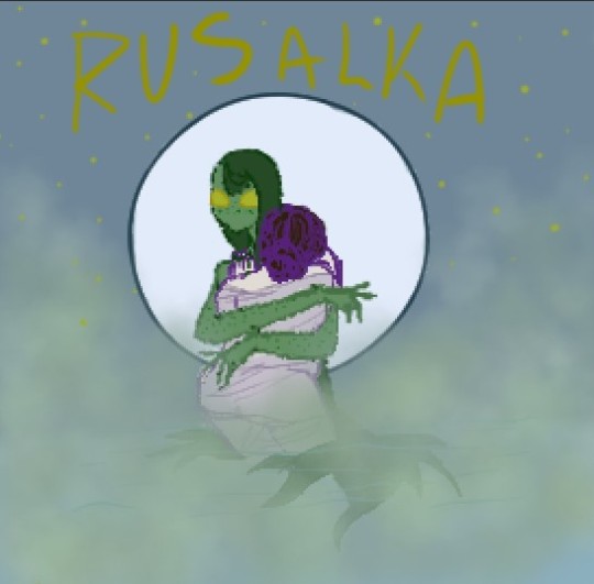
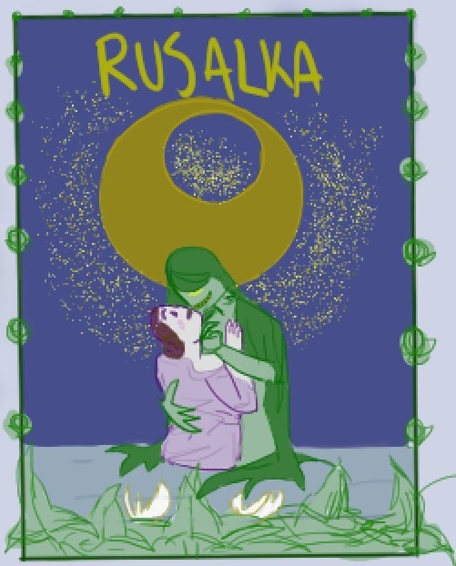
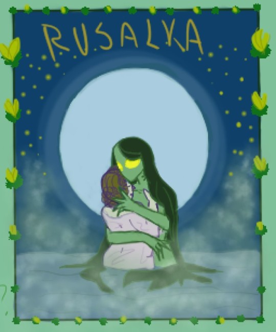
I wanted to evoke a dreamy and mysterious atmosphere. So I made a gamble and decided to have fog in the art (this will come back to haunt me later...)
After some feedback and some thinking, I picked from the things that worked from those drafts to make one for what would be the base for the actual cover:
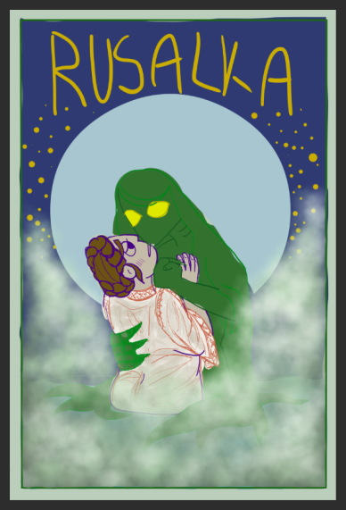
(wow get a load of that funky green blob)
Then I cleaned up the linework for that!
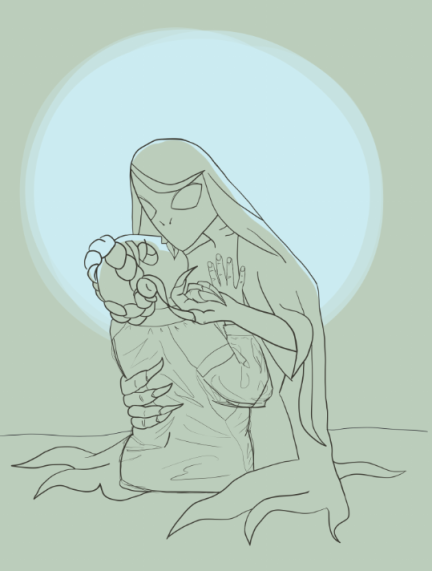
Now this is where that fog comes back to haunt me. I was playing around with possible borders, but found they were a bit distracting. Instead I tried out putting a border around the moon and ADORED it. The thing is.... that fog was not fitting the vibes and was hiding way too much

So I spent many hours looking at Art Nouveau pictures and decided I'd give a go at trying ~stylized~ fog instead
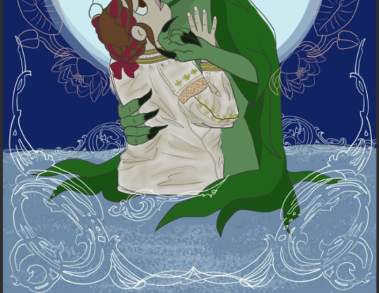
Loved that, but was starting to not vibe with the U of the moon and the pink of the flower border... {RIP pink flowers}
From there it was cleanup land, but something still felt very missing
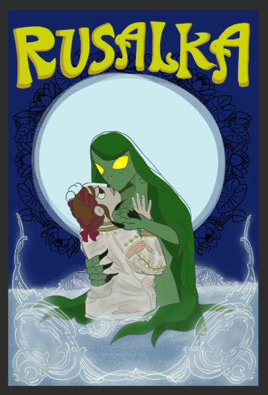
AND THAT'S WHERE I HAD THE IDEA TO TEST OUT STARS IN THE FLOWER BORDER AND I WAS DELIGHTED!
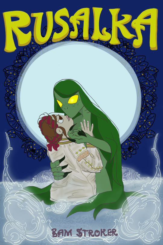
Honestly I'm really proud of how it turned out, and I learned a lot from the process. I think the covers I make in the future will be much quicker because of what I learned with this one.
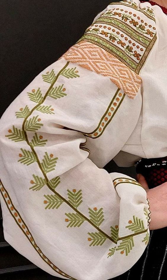
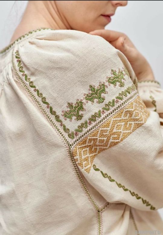
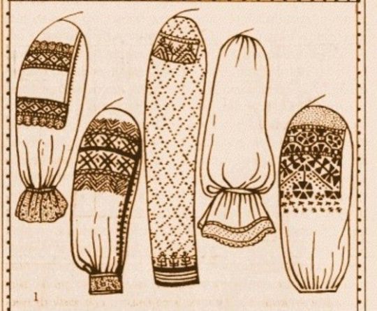
Also here are some inspo pics of historical embroidery/clothes that I pulled from for Sasha's outfit:

5 notes
·
View notes
Note
your art is sooooo awesome. whats your process
OMGGG!!!! tyyyyy that really means a lot :3 <3
typically my process involves working with a certain programs bitmap, sometimes krita and mspaint but only if im in the mood, and i start by doing outlines/rough sketches in the default color, with variations on the same color slider if something needs to be different than the previous colors ones, i typically work all on one layer so (old examples shown here ⬇️ i dont rlly have much wip art stuff so i dont really save things that are unfinished)


then i redraw over that with actual linework, typically either black or an extremely dark color so things match up, (ex, dark green if im drawing something green) and then i usually convert the whole thing to vector so i gain layers again, then i use the colors i selected for the base linework and fill in the entire background layer with that, then i convert it back to bitmap again, then i use the clear bucket tool to get rid of all that color but it keeps the clean linework, then i do cleanup so everything looks right. then i add color with the bucket tool again, (a good example shown here in an old draft of another previous art thing,and so i dont feel like remaking the entire process for this ask so im using old examples)

then afterwords i add detail like shading and little tics and notches and highlights and a lot of times ill fill in shadows with the color of the linework and sometimes ill thicken the linework in places, i usually do this on 4-1 sixed pixel brushes


and then ill add a real background and final touches and yapyap whatever im pretty much finished, for a while i used to just screenshot my art but i realized that you can export files so i do that now for a crisper finish.
and i cant really explain what my process is for sketchbook and physical stuff, i just draw whats on my mind, for more important stuff ill use pencil for an outline then erase it after inking. for animations its just the same process i always do but i ignore the details besides sometimes shading, it makes the process go faster and cheaper, and then i just import all the drawings individually into davinci resolve8 to string together and animate. and if this ask was looking for like. my process for drawing things. i usually just simplify details and make note of shapes and body language and stuff you knoww, its how i simplify complex mecha into niche character designs.,,
4 notes
·
View notes
Text
Ugh
I feel so horribly disorganized.
Right now, I'm trying to transition between this cleanup from the script into the graphic novel, I'm trying to squeeze in some clarifying text and some clarifying frames and so instead of really being able to batch--linework then ink then lettering then coloring--I kinda just have some frames here, some frames there, clean those up, reorganize my art folder where I can look at the frames chronologically, then figure out what I'm editing next. Ugh.
All I have to do is survive my cleanup, though. I just have to make a few more frames for this section, then maybe I'll take a break and starting queuing up for the end of my hiatus. That'll be a nice change of pace. I have to make a new page template though. My current one has this huge margin on the left and right and I don't love that look for the web comics, but I like a bit of margin between each frame in the strip. Actually, now that I think about it, I may not have enough cleanup done from the script to the graphic novel to do too many strips....
Depending on how many frames I come up to after editing, though, I worry that I might possibly have to change my transition?
1 note
·
View note
Photo


woohoo process! here’s how i made page 1 (and briefly 2) of this bad boy (x), and basically how i do all my comics. or, at least, all the little square ones
i have a pretty simple process. i make simple things
thank you for reading, if you did!
transcript below bc wacky handwriting:
1. script + thumbs!
i take the little poem scrap i’ve written and i come up with some corresponding visuals in thumbnail form. i like to thumbnail in a sketchbook or on little note paper. this is a 4-panel square comic, so panel width or number per row do not matter as much, unless we break form for effect. as you can see [pictured], i re-did the second panel a few times. rip me
2. panels!
i do a vector/linework layer as a guide for projects over one page, so it’s consistent [note: i use paint tool sai]
grid tips: make a canvas ¼ size of your page and fill it with a colour, and then paste it twice in your page and move them to opposing corners on your page, so you have a little 4-square checkerboard on which to map out your grid!
3. words!
stick them down roughly where they’re going to go, and separate longer phrases for rhythm (and also because of space constraints). i also made the canvas a bit taller in order to accommodate the title and page numbers. [final size is 2000 x 2100 pixels, if anyone wants to know]
4. sketch!
sometimes i sketch! sometimes i don’t. it’s basically the thumbnails again, just for better placement in the actual page.
5. lines!
the final linework! the red lines [in the image] are on a separate layer. i started to shift the words into their final positions so i could draw their speech bubbles.
6. cleanup!
the most gratifying step! note: in order to keep the word and panel layers separate, i coloured the panels white rather than erase them [where they meet the speech bubbles and i want to break the panel]. in the bottom right panel, i decided not to put bubbles, for style :)
same process for page 2! [i like to get all the lines done fully before i get to colours so everything is kept consistent]
7. colours!
for this i was trendy and hip and used only two main hues [pictured: a green-leaning-blue and an orangish-red], and one was quite unsaturated [the blue] while the other was not, for balance (i guess).
8. (optional) overlays!
i was pretty happy with the colours already but overlays are just fun ok [you can barely tell the difference lmfao].
i had one layer with a [very unsaturated blue, at the midpoint between full dark and full light] and one with [the same but orange, because complementary colours], and set them both to 50% opacity and merged them [note: it’s better to merge and Then turn down the opacity]. and then i added another full-opacity [desaturated blue] layer because i am never satisfied.
boom it’s done thank you for reading love you
302 notes
·
View notes
Text
More Than Meets the Eye #16- All the Greatest Love Songs are Secretly About Heroin
Dang, been a minute since we got into the series proper. What all happened again?
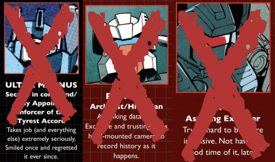
Oh. Right. That.
…So anyway, let’s brush up on our Ultra Magnus history!

There was a massive fight on top of a spaceship. Swoop was there, Impactor was there, Overlord was there, Heretech was there, Killmaster was there- shit was lit. Ultra Magnus was doing his thing, though it looks like this was before he got LASIK done, because he’s got a visor on.
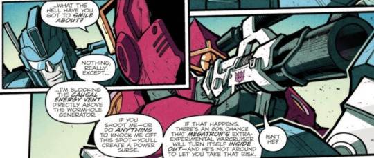
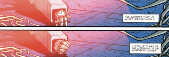
Then Ultra Magnus got shot in the gut and fell off the spaceship. It was so scary his hand started spasming.
Later on, we return to a place we’ve seen before, albeit from the Decepticon side.
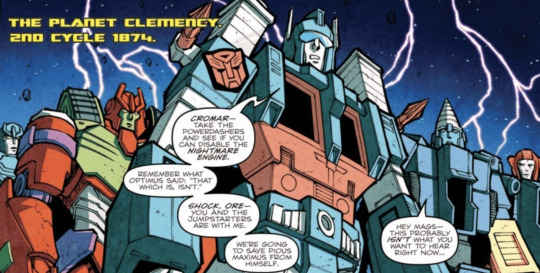
Magnus, your badge isn’t up to code, my guy! Better get that sorted, before your current self comes out of his medically induced coma, invents time travel, and comes to beat you up.
Also, Pious Maximus? What is your friggin’ DEAL, bro? What the actual hell is your deal?
All the K-Cons start falling out of the sky, and Magnus orders everyone to take cover, as a familiar-looking bomb that literally has his name written on it lands bang on target. It’s such an intense experience, his hands start spasming.
Later still, Magnus is in the middle of dealing with the Simanzi Massacre, and it looks like his visor’s seen better days. Hopefully it was a reading pair, and not something he actually needed to see. Rotorstorm is also there, because his character apparently only exists to suffer. Magnus and his team rise from the muck and the mire, coming ashore right on top of a Cybernought, which promptly fries Magnus with its hand lasers. He gets so crispy, his hands start spasming.

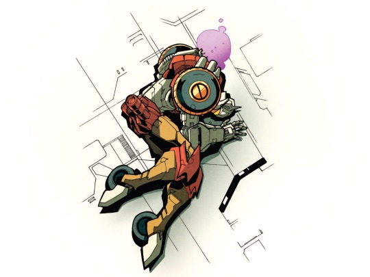
For anyone having trouble parsing the scraps of rended metal that used to be Rewind of Lower Petrohex here, allow me a moment to break him down. That cylinder in the lower left corner is his camera, the wire coming off of it is where it plugged into his head, and that squarish chunk with the clean, round hole in it is probably part of his helmet. The other chunky bits I couldn’t tell you what they are, but I think it’s pretty safe to say that Chromedome absolutely put the dog to sleep with that blast last issue.
Inside the Lost Light, Swerve’s trying to be a nice guy by putting on some tunes for Ultra Magnus, who got his spark shot by Overlord last issue, but all it’s really done is make Ratchet get distracted.
Magnus is in a bad way, as was established by First Aid last issue, and it doesn’t seem like Ratchet’s having any more luck than had been predicted. Swerve’s here for emotional support, and also because he’s got medical training. Tailgate’s here for cleanup duty. Drift’s off in the corner making snide remarks about the medical equipment, probably because he’s mad his legs are still off.
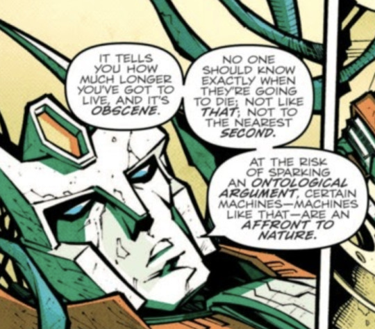
Drift looks like he’s been chiseled out of stone here, and I kind of love it. Forget softboi uwu Dwift, I want more of this guy who’ll bite into a teddybear cactus and not even flinch.
Agustin Padilla’s back on the scene for this issue, and he’s decided that everyone’s going to be elongated in as many ways as he can manage in 20 pages. Tailgate and Swerve? Tallest they’ll ever be in the series. They’re as tall as Cyclonus, and he’s a fucking space jet. Someone’s got a chevron? You better believe that thing’s scraping the gotdang ceiling. Drift’s kitty-cat ears almost never fit into the panel, because those suckers are LONG today. It’s like they’ve all been put through a taffy-puller. There are a lot of little quirks with this art, but this is one I can kind of get behind, if only because it’s so distinctive.
Getting back to the story, Drift’s talking about the Death Clock here- no, not the animated band from Adult Swim, but an actual medical device that can calculate the moment a shrinking spark will give out, down to the second. It only measures the lifespans of the terminally ill, so Swerve hasn’t accidentally given himself even more depression by sticking his little hands in the shiny light without a thought as to what the device he’s messing with might do.
Ultra Magnus has about ten days to live. This makes Tailgate incredibly upset, because he, unlike everyone else on the ship, hasn’t experienced the horrors of war and death.
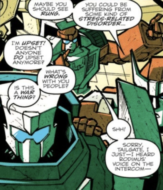
Ratchet’s right, though. There’s certainly a chance that Tailgate, who’s been shown to react to stressful situations by having panic attacks to the point of blacking out, could have a very severe response to what is his first major catastrophe. Post-Traumatic Stress Disorder usually isn’t an immediate development, but being proactive about your mental health is never a bad thing if you can swing it. Hell, with how bad the Overlord situation was, I wouldn’t be surprised if Rung was booked solid long enough for Tailgate to actually have time to develop PTSD.
Rodimus is on the intercom to address the situation that just took place, because man oh man, was it a doozy. He intends to hold an inquiry to figure out just what the hell happened and how Overlord got on the Lost Light to begin with. As he tells everyone what’s going to happen, our focus shifts to Chromedome, who’s standing on the outside of the ship, staring off into space.

Man, I hope Chromedome’s on the front half, because this is a fucking grim scene to witness.
Skids comes out, having been looking for Chromedome. Trailcutter of all people pointed him in the right direction- which I suppose makes sense, given that he was on the Ethics Committee on Kimia. He probably would know Chromedome and Rewind decently well by this point.
Chromedome turns around to show off his mourning black Autobot badge, freshly photoshopped onto his chest for our viewing pleasure. It’s especially blatant when contrasting with Padilla’s rougher linework style.
Skids asks our brand-new widower how he’s holding up, and Chromedome says he’s fine, which is funny, because the other day he was all:
Chromedome has a moment of reminiscing, playing connect-the-dots with the stars like he and Rewind used to do all the time.
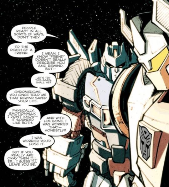
Skids, they were married for 250,000 years.
Skids might actually have been one of the worse people to have found Chromedome, if this is what he’s going to say, and then immediately leave. He’s so awkward and clearly uncomfortable and doesn’t want to be there. Does he feel weird about Chromedome knowing more about him than he himself does? Does Skids not have access to any of his memories related to mourning? Geez, I hope nobody needs him to help them through a difficult emotional time for a good while, because this was painful to watch.
Back inside the ship, Rung’s come over to Rodimus’ room to see what all the crashing and banging is about. It would seem our dear captain’s upset, and has decided to work through his frustrations by destroying his private quarters, perhaps in an attempt to summon the wrath of Ultra Magnus, thus saving him through the power of his own mess-induced rage. Rung comes to sit with Rodimus, I guess giving up his search for Chromedome, and the two of them discuss Magnus. Specifically, they discuss Magnus’ memos, and how much Rodimus despises receiving them, because they make him feel like he’s not doing his job right. He stopped even opening them, they made him feel so bad.
If you subscribe to the headcanon of Rodimus having ADHD, you could potentially read this as being a manifestation of Rejection Sensitive Dysphoria. As it is within the story proper, Rung’s decided to ignore this tidbit of information to get at the more pressing issues, like why exactly Rodimus felt the need to wreck his room.
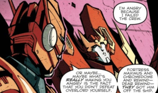
This is about the point where the art for Rodimus becomes roughly 90% spot blacks, and it’s highly suggested that Rung get out while the getting’s good.
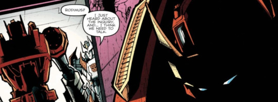
Oh, well this is going to be awkward.
Later on, we’re at the funeral. There’s five coffins, though not all of them actually contain a body. Everyone’s here to see their friends off, even Cyclonus, who was invited to the wake by Chromedome himself. Awful nice of him to do that, given their history.
The lineup in the front row is a bunch of chatterboxes, and they prove that very quickly as Swerve, Skids, and Whirl theorize on the contents of Brainstorm’s mysterious briefcase, which is also here at the funeral. Swerve swears himself to the duty of finding out what’s inside, on threat of death should he fail.
A short time skip is had, and Rodimus is revealed to be wearing his ceremonial funeral cape and terrifying vampire arm spikes to this shindig, as he sends Tripodeca, who is surely the most beloved of all Autobots, off with as many kind words as he can muster in the time they have. Everyone says goodbye, and we get to Rewind’s turn. Rodimus has a moment of pause, as Rung gives him the most withering look I believe he will ever produce in the entirety of the run of MTMTE/Lost Light.
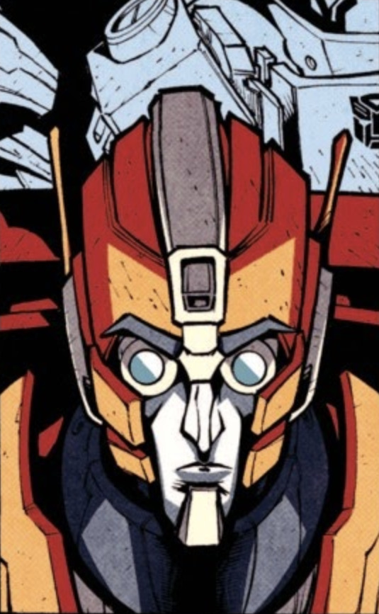
Rodimus concedes to giving Rewind the credit for saving everyone from Overlord posthumously, as well as Fortress Maximus and Chromedome, labelling himself as a failure on that front. Chromedome comes up to the podium for a few words on the love of his life.
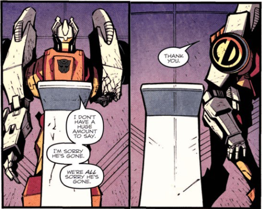
…well, it’s been a long day for everyone, I suppose.
Chromedome sits back down, right next to Brainstorm because they’re besties, as Brainstorm stares him down like he knows something Chromedome doesn’t.
Probably because he does.
After the funeral, Brainstorm pays Chromedome a visit, finding him in the middle of spring cleaning. He’s taking all of Rewind’s stuff and shoving it in a box to be destroyed.
Does it count as foreshadowing if it’s like a page before the reveal? I guess so.
Chromedome is trying to ease Brainstorm’s mind about the inquiry Rodimus is conducting, saying that the guy ought to talk to Drift before he gets TOO antsy about spilling the beans- perhaps a touch too late there, Domey- but Brainstorm isn’t here for any of that.
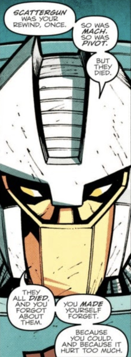
So you’re saying Chromedome/Dominus isn’t going to be endgame.
Turns out Chromedome’s been collecting dead spouses, and he wasn’t even aware of it. When faced with this inherent truth about his personal relationship with grief, Chromedome only has this to say:
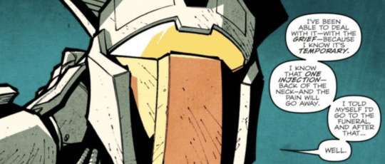
Time for a pop quiz!
When the burden of life is too much to bear, what is an addict most likely to do? Is it:
A) Quit cold turkey
B) Seek help for their addiction
C) Relapse
If you answered C, you get a gold star, and a harsh reminder that addiction is a fucking monster that will devour your life and meaningful relationships, leaving you with nothing but itself for company.
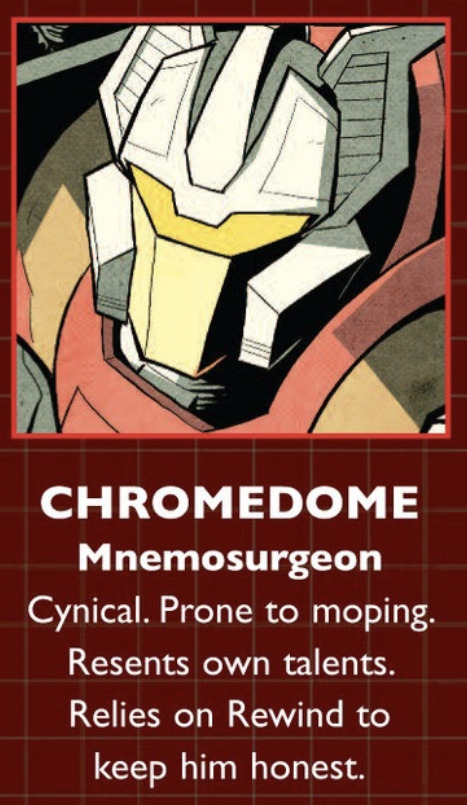
Chromedome has had a problem with injecting since he got good enough at it to get his own set of finger needles, and he’s been completely dependent on other people to get himself to even close to stopping the habit. His character bio on the crew roster page has, up until this point, outright claimed this.
Now Rewind’s gone, and there’s really nothing stopping him from just taking that pain away. Brainstorm certainly can’t do it, though not for lack of trying.
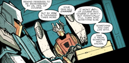
Chromedome says that he won’t go through with his plan, but Brainstorm knows he’s lying, because they’ve done this song and dance before. At this point, asking Chromedome to not inject is just a courtesy to the deceased.
No wonder Chromedome invited Cyclonus to the funeral- probably figured why the hell not, since he wouldn’t remember it anyway.
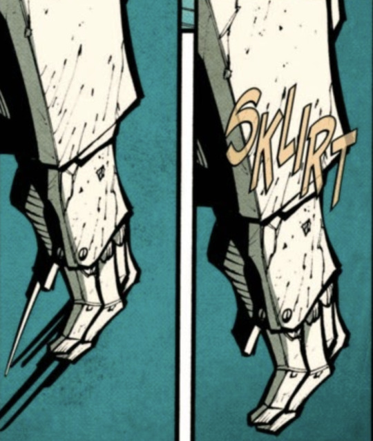
Brainstorm gives Chromedome a data slug- the last one Rewind ever made, shot through the door just before it sliced Chromedome’s arm off, and found by Fort Max. Brainstorm leaves, probably to go prepare himself for that awful, hollow feeling he’ll be getting the next time he sees Chromedome.
Over in the shuttle bay, Rodimus is addressing the crew, Chromedome is retconned into being Toxin because he’s not supposed to be in this scene, and Drift is named as the sole conspirator in the Overlord debacle. Rodimus just starts tearing into Drift, and while he does, we cut over to the medibay, where some zombie nonsense is going on.
Golly, seems like there’s some flavor of undead on the Lost Light every other week, doesn’t it?
Rodimus strips Drift of his Autobot badge and tells him to get the fuck out.
Back at Chromedome’s room, he’s decided to take a gander at what Rewind left behind, plugging the data slug into the computer.
Man, this part always makes me a little weepy.
I can’t do Rewind’s final message justice, not in the choppy format I present here- which is perhaps a bit ironic, given the nature of how it’s presented. In the final moments he had, Rewind pieced together a plea for Chromedome to love himself, and to remember that he was- and still is- loved. He shared his own fears of them being apart, and how he knows how hard the coming days will be. He begged Chromedome to be kind to himself, because he- whether he believes it or not- has grown from the person he was in the New Institute.
As this message plays out, we see Drift swarmed by furious Autobots, who get violent as he makes his way off the Lost Light, only to be helped back to his feet by none other than Ratchet, before climbing into a shuttle, surely never to be seen again.
Shane McCarthy slipped Roberts a twenty to set up a slowburn between his OC and Ratchet all the way back in MTMTE #4. This is the start of the pining portion of their relationship.

God, just- there’s a reason Roberts has claimed this issue as one of his best, and it’s this fucking message. Please, if you somehow have gotten to this post without reading the comics- well, first, how, and second- go and READ THEM. I promise it’s worth it, they’re beautiful and funny and full of heart, even when everyone’s being a dick to each other.
Rewind leaves Chromedome with one final piece, which probably didn’t feel like enough, but was all he could manage in the time he had left.
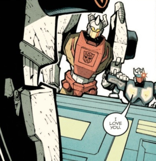
I’m basically legally obligated to post this panel.
Let’s take a moment to consider Rewind as a character. He’s an archivist, and one who’s gotten very good at his job over the millennia. The guy’s OBSESSED with history, and recording as much of it as possible.

Which stands to reason that he knew about Chromedome’s past conjunx endurae. I mean, why wouldn’t he? It would be public record- even if you don’t necessarily get a marriage license on Cybertron, Chromedome would have been on the paperwork with these other guys somewhere, and the fact that he wouldn’t be able to answer the question of “Who’s this guy you lived with for several thousand years?” Would imply some… rather unfortunate things.
Rewind also has a hard time letting go of things- he gets jealous of Chromedome’s past relationship with Prowl any time it’s brought up, and he’s still looking for his ex-husband after what’s probably been at least a million years. That, combined with the way Rewind lives his life- you know, recording every single moment of it- gives me the impression that he really, really wouldn’t enjoy the idea of being forgotten. He wants Chromedome to stop injecting because it’ll kill him, of course he does, but he also wouldn’t want to be erased.
The video cuts off, leaving Chromedome alone. It’s all up to him now, whether Rewind gets to stay in his heart now.
Chromedome/Dominus is still on the table.
With THAT crisis of love dealt with, we move back on to that weird zombie nonsense we saw a little bit ago. Ultra Magnus is missing. Odd, that.

Ratchet, how many times are your patients going to have to disappear from your medibay before it’s less of a “them” problem, and more of a “you” problem?
As Ratchet goes off to search the rest of the ward, Tailgate accidentally bumps into the death clock, which gives him a nasty little surprise: apparently he’s only got three days to live.
Yeah, this is the point where the comic kicks into overdrive, plotwise- there are no brakes on this train anymore.
#transformers#jro#mtmte#issue 16#maccadam#Hannzreads#text post#long post#overthinking about robots#incoming analysis#comic script writing
70 notes
·
View notes
Note
i dont know if you've answered this beofre, but i love your lines! what sort of brushes do you use? they're so nice and crisp!
i actually just use the pencil tool in photoshop! i don’t use anything fancy. the pencil tool is just a binary pixel brush that most if not all modern drawing programs should have-- i tend to use it at anywhere from 5 to 7px width and i usually start with a canvas of AROUND 3000 by 2500 pixels, with a resolution of 72. that size usually yields the most smooth looking lines for me! i also make sure that the brush has size dynamics on with a minimum diameter of zero. when i make linework i usually do a LOT of cleanup as the last step of the drawing to make sure the pixels are looking smooth and theres not alot of janky square edges left. it’s sort of unconventional i suppose!
30 notes
·
View notes
Note
This is a question for Kiriska! May be slightly off topic, but what is your process for digital cleanup once you have scanned something in? Your prints always come out looking so clean and nice
Kiriska: Honestly, most of my digital clean up is clone stamping cat hairs out of my scan lol, but basically the process goes like this:
Scan at 600dpi so it’s bigger than I’ll (probably) ever need it and allows me to fix even the smallest of details.
Adjust levels and color balance as needed/desired. Sometimes I adjust for accuracy to the original; sometimes I adjust to achieve saturation or colors that are difficult to produce with the media I used. Levels is probably the single most important adjustment I make.

Setting the “black point” or “white point” via Levels adjusts your image so your selection point is pure black or pure white, which can help balance the rest of the colors in the piece. This is especially helpful for scans of BW lineart, since you can use it to set the background as pure white.
Zoom into 100% and go over the entire piece to clone stamp out cat hairs. There are always way more cat hairs than you think there are how does this always happen?? If there are really long cat hairs or it’s really excessive, sometimes I’ll just try to clean off the piece and rescan.
If I did the piece in multiple parts, I’ll compile everything together at this stage. For example, in my recent Snake piece, I did the calligraphy separately and have a file saved with my stamp signature. I put those separate pieces together in Photoshop. Some pieces, like this one, are made up of a lot of different parts.
After that, I sometimes add white highlights digitally. I’m often unsure about how white highlights will look, so I avoid doing it on the actual piece until I know how it looks. If it looks nice on the digital copy, I’ll go back to the original and add it post-scan, but the scanned version will remain with digital highlights because they’re cleaner (and I can also adjust opacity or color).
Sometimes I’ll do specific spot color corrections by putting color on a layer over the scan and then setting the layer to Color or Hue.
The last step is a texture overlay usually on low-opacity Multiply or medium-opacity Soft Light, though not every piece has a texture.
But basically a majority of my adjustments are for color or small mistakes. I don’t really feel like I do a lot of digital clean up since my originals tend to be fairly clean already, especially in terms of linework because I prefer to fix as many things as possible on the original. (I messed up inking that Snake piece initially and just lightboxed and re-inked the whole thing over instead of trying to digitally do anything. :P)
Feel free to send further asks about process to my art Tumblr though! You’re right that this is a bit off-topic for HTBACA. ^^
80 notes
·
View notes
Text
What is it like
What is it like to get anything that you've worked really hard on, worked really hard for? Do I just not work hard enough? Am I too easily discouraged?
Sometimes, I think we comfort ourselves by saying it wasn't the right time, we weren't the right person then. Yeah, if I'd graduated in 2014 or 2015, I most likely wouldn't have gone on to create this graphic novel. I probably wouldn't have any sort of "made it" worth the BJDs that I spent more than the three years of college I got, planning. And I definitely wonder what happens to a lot of these people who get their degrees worth thesis projects that don't seem to have any point--what about the ones who demonstrate aptitude?
Maybe if I'd finished my degree program, I would have done the graphic novel worth dolls; a slower start, but the actual storytelling process would have been so fucking efficient.
If I can really gain speed on this script, if I can complete the script and have the corresponding art, if I can score an agent--that part feels really beyond reach. I mean, I'm even having trouble--although it's only been a few days since I really knuckled down with the script--I'm having trouble staying focused for more than a couple of hours at a time. Plus, there's no universal graphic novel script format, so honestly, I happened across the script format that Darkhorse has and fuck it, I'm just going to use that one. But every time I look at that one, I notice something else that I need to add or fix. And then there's the actual script part.
I could easily just go through what I have of the writing so far and pull the script out of that. But then I compare the written script to what I have of the art and it's........ not good enough. So I go back and make the script better reflect the art. Back and forth, back and forth, just like the art. Chunk of rough pencil, chunks of tightening my penciling. Chunks of inking, chunks of cleanup, and finally to coloring.
Honestly, I'll probably short-hand the art once I get to the end of the thumbnails that I have. I don't think I can write the script without my visuals.
I could see my thumbnails going one of two ways: either I have a dedicated book--which I more than have enough paper to make up--or, since the linework books are just for me, I could divide the back of each page into four for thumbnails and every couple pages, plan out a few lineworks. I was kinda looking forward to building this finished linework book as I go, so I'm not wrestling with a sketchbook that's too big or won't actually lay flat. If I decided to stitch some signatures together for either part of the project, I could just stitch together like fifty or a hundred pages. There's no law stating that these books have to be huge. I just like them that way so there's fewer objects to find and organize. If I either don't cover them or give them a lightweight cover, essentially just some extra pages to protect the pages that I use--such as a couple sheets of cardstock or some scrapbooking paper--I could kind of even justify sandwiching volumes together. It's always fun to make some books..... and I could probably use the visual real estate.
Anyway, I'm rambling. Probably the best move as I keep trying to work on lineworks, and moving to a point where I'm either going to want to organize/rework my thumbnails, or move forward with thumbnails that I have never yet illustrated, would be to sit down for five minutes and stitch together some little print blocks. And by little, I think I pretty well mean little, something I could fill up kind of quickly and set aside. They're mostly for my own reference anyway.
Here's another thought: I know with a publisher of graphic novels, I'm much more likely to get away with submitting like, a single volume or issue, but I'm thinking very seriously about releasing either day by day chapter/volume, or maybe it would be best to release them by the week. I'm not really sure. In the actual writing of the script, I'm up to page like, thirty-five, and I have over a hundred panels, and maybe my pacing is terrible, but I'm just getting to the point where my protagonist is getting around to crossing the metaphorical, and literal, threshold. And it feels like the actual crossing is going to take like another fifteen to twenty pages. And yet another ten to fifteen pages until we cross another checkpoint in the narrative.
Going day by day almost seems appealing on a like, issue/piece, getting the story published and out there, basis--except for the part where I would basically have to create filler, and I don't really want to write more of some content than I have to.
0 notes